Statement of Intent
For my initial research research I will start by looking into Light and dark photographers. At the moment I am thinking at looking at Michael Levin's work as he has the most interesting Light and Dark images. Also he uses a very good technique for Light and Dark which is creating a shadow behind the objects. This will provide me a better view of how I can change the perspective of the Light and Dark images to make them unique and stand out. I am also looking at taking images of objects that can be effective when light and dark is applied. I am going to start creating shadows behind my images as a guideline until I am going to start adding techniques in later photo shoots that I hope will make the images successful in light and dark.
When I chose this theme, my initial thoughts were of old images that were taken in black and white. After reading over the name and looking at some examples, I realise that light and dark doesn't necessarily have to be black and white but only has to show a contrast of black and white in the image that can have effect. Also, I initially thought the filter was the main reason there is a contrast of black and white, however the objects inside the image could show the contrast of black and white and could still be effective.
To show progression through my work I will start by photographing basic objects which then would be photo shopped to fit the light and dark theme. Further on in this project, I intend on creating images that use effective techniques like still life or depth of field to add more quality to the image as light and dark won't be the only strength. However, to show a sufficient amount of progression in this project I plan to visit a place to take images of landscapes that can be edited later on in photo shop.
Not only am I going to use techniques such as still life and depth of field, but I plan on using more advanced techniques such as the 5C's. The 5C's will help me develop in my images by helping me think of the weaknesses in my images as it is a technique that cannot be used in front of camera, but in my head to help me take images. For example, composition is a technique that can give me an idea of what position I can take my images in in this specific project. Also, content is a technique that will help me think of what I need to include in my image to make it effective.
For my first week, I intend on researching this topic in detail. I will do this by creating a mood board of images that I find interesting that I can follow in my images. For my second week, I plan on analysing this project by using the 5C's on an image that has been created, using this theme. For my third week, I am going to create a plan for my photo shoots that will guide me. After that, I will start my first photo shoot.
As my project progresses, I will be accepting advice from other students for my images to help me improve on them. I will also be offering advice to other students so that I can look at their strengths and weaknesses, which
will give me a perspective of what I have done right/wrong and what others have done right/wrong. This will provide me a contrast which will help me improve my images from viewing other students work.
Light and Dark - Objects


Coggle - Light and Dark

My chosen theme
My theme is light and I have chosen this theme because it is a very interesting topic. Also I like the fact that every picture stands out with the combination of light and dark. My first ideas are to take pictures of objects behind a white background so I can edit it on Photoshop. After that I am going to the lake to take some pictures of the river which is what Michael Levin has done. In the objects I am going to add color to some of them on a black background. However on other objects, I am going to edit them to be white on a black background. This is because it will make it stand out like the objects in my mood board. Whereas, on the lake pictures, I am going to stick to the light and dark theme by applying it to my images. This would make the image stand out. I am interested in Michael Levin because I like his style for his images on the lake. I want to develop my Photoshop skills in this project. This is because I need to practice using this application so I am familiar in the future when I am taking images.
Analyzing an image using the 5c's:
Content:
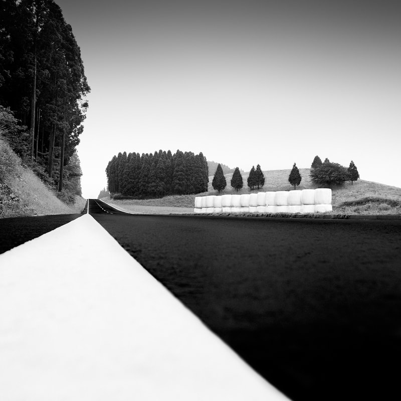
In this image I can see that there is a road that is going in a straight direction. Also there are trees and a lot grass on a hill, surrounding the road . This shows the nature behind the image as there is a lot of green. The sky is dark and cloudy to make the image more interesting because the sky is usually blue. Also the image is quite peaceful and quiet as there are no cars and no people, there is just nature. The image looks new because the road looks modern and there are plenty of trees. The image is just black and white which makes it stand out. Some objects are white and some are black to help each other project them selves under a light and dark sky. I am unsure of where this image was taken but it looks like it was near the mountains as there are lots of trees. The background is a little foggy to add some eerie feeling toward the image.
Connection:
This image links to my work by it being light and dark. Also it is a picture of nature which is what I am focusing on. This gives me some ideas for what I can do when I am taking images on nature. It can help me for when I am going to Photoshop my images by giving me ideas in what I can add to the background of it. The image has been taken in a worms eye view which helps me think about what angle I could take my images in. In my opinion, I think there is a message behind this image which is that the motorway is cutting aside nature by being in between each side. This could mean that man made structures are ruining nature and that we need to respect nature more. As the image being black and white, it inspires me to take these types of images because it gives a lot of power behind it.
Comment:
I like the fact that parts of the image are black and some other parts are white. This makes it stronger by having the combination of black and white. Also I like the fact that some trees are split up and on it's own whereas some are in groups. This tells me that nature is meant to be together, not split apart from each other. However, I don't like the fact that the image has been taken on the left and not in the middle. I don't like this because it is cutting the left side of the image out which makes the image less detailed. This image is inspiring because there are very strong filters that are being used. For example, in the background there is a foggy filter which is great behind black and white because fog is a mix between black and white. Also the image has been taken in daylight so it easier for the photographer to edit it on Photoshop which inspires me to take my images in daylight.
Composition:
The focus point for this image is a worms eye view. In my opinion I think the writer has done this to show more in the image, like the sky which gives more meaning to the picture. Also, looking up at the trees in black and white is very effective because it makes the trees look more intimidating. The photographer has done this cleverly by making us look small and nature look big to show that nature is very important, therefore we need to respect it. The lighting is soft which is effective because it creates a contrast between light and dark. I believe they have not used the rule of thirds as it is not focusing on a single part, but it's focusing on the entire image. My eye is drawn to the bunch of trees as it is standing out on a white background and it is in the middle of the image. The depth of field is mainly focusing on the background of the image rather then the road which is effective because it is drawing my attention straight to the trees.
Context:
This image was taken by the photographer, Michael Levin. Michael Levin is a Canadian photographer, best known for his ethereal black and white landscapes.
Analysing another image using the 5c's:
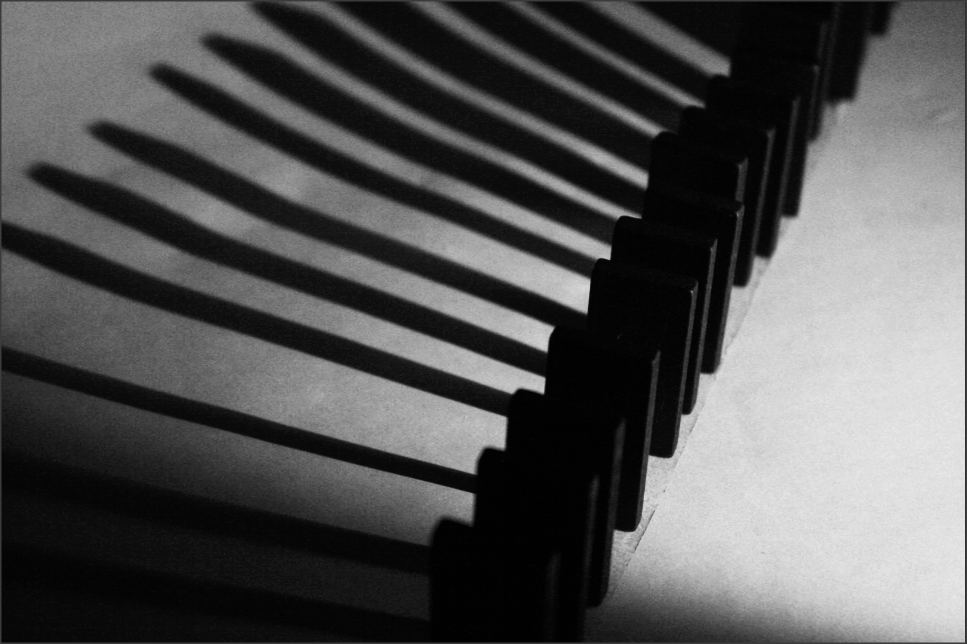
Content:
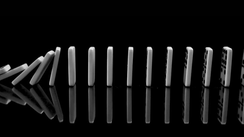
In this image I can that there are domino's knocking down. The image has been taken in a direct perspective which is effective because you can see the reflection of the domino's. Also the image has a black background which is effective because it helps the domino's stand out. This image must have been taken in a studio because you cannot have a black background from outside. Also a table must have been used for the domino's to stand on. The image has a mirror underneath the domino's to give a reflection underneath them.
Composition:
In this image the photographer uses shutter speed. This is effective because it shows how the domino's are knocking each other down. The lighting is mainly focusing on the top of the domino's which creates a contrast between the dark background and the white domino's. The photographer has used the rule of thirds. I can tell this by there being nine sections and there being two lines in the middle. My eye is drawn to the falling domino's and the reflection of the falling domino's. The photographer has achieved this by using shutter speed which is effective because he has caught the image last minute when the domino's is falling. There is a shallow depth of field which is effective because it is just focusing on the domino's. I think they have used a tripod because the image has been taken directly.
Connection:
The theme of this image is light and dark and it is a picture of an object. This is similar in what I am doing by taking images of objects applying light and dark. This image links to my work because it is light and dark and the image has similar things that I am thinking of doing. Also it has a great angle for the image which shows all of the domino's. In my opinion there is a message behind this image. The message behind this image is that each domino is equally balanced and if one falls, all of them fall. This image gives me more ideas on what I can do with my objects and how each angle gives information about them. In my opinion, this image is black and white because the domino's gives a great contrast between the white and black background. I am certainly thinking about doing this in my project as it gives my images a great effect.
Comment:
There are many strengths about this image but there are a few main ones. Firstly, I like the fact that there is a mirror underneath the domino's, giving them a reflection. Also I like the fact that the domino's are taken in the shutter speed camera setting to show that they rely on each other. I like the fact that the image has a shallow depth of field by the camera mainly focusing on the domino's. This effect is great because it draws my attention straight to the domino's. In my opinion there are no weaknesses in this image. I can use this to inspire me because it gives me ideas on what I can do in my photo shoot. The meaning behind this image is that each domino relies on each other.
Context:
This image was taking in a studio on a tripod with lightening. The purpose of this image was to create a meaning. This inspires me to give meanings to my images. I think the photographer took this image to create a meaning behind it that domino's rely on each other.
My Photo shoot Plan:
My First Shoot
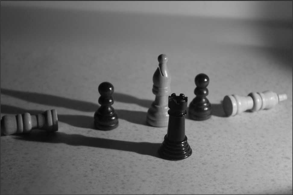
For my first shoot, I decided to follow the style of the black and white chess pieces from my mood board. I intend on capturing the shadows of the chess piece more then the chess piece itself as it will look very effective in black and white as I saw in the example image. However, I am going to involve multiple chess pieces to get a range of shadow sizes as they will be grouped in different sizes.


Best Images
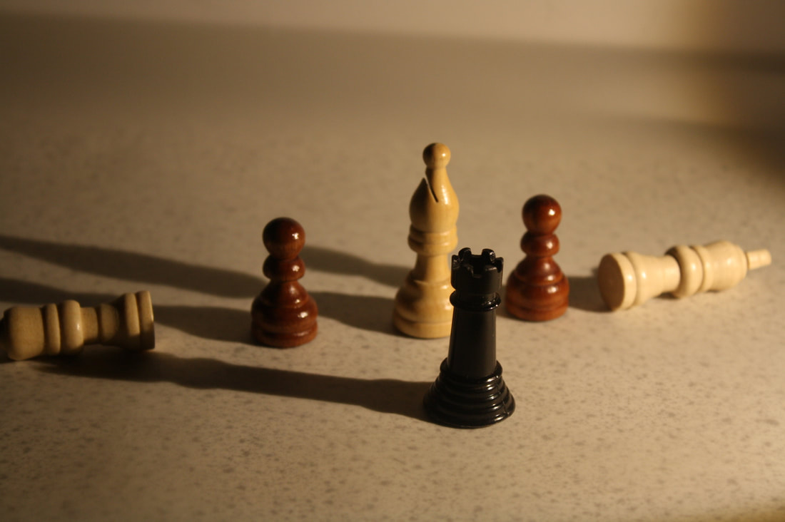
In my opinion this is my best image for the first gallery because the objects has a shadow behind them. This is effective because it gives the image some darkness to it which stands out on the white background. Also the angle helps the shadow become bigger. I like the fact that the image has colour and they are in a pattern.
|
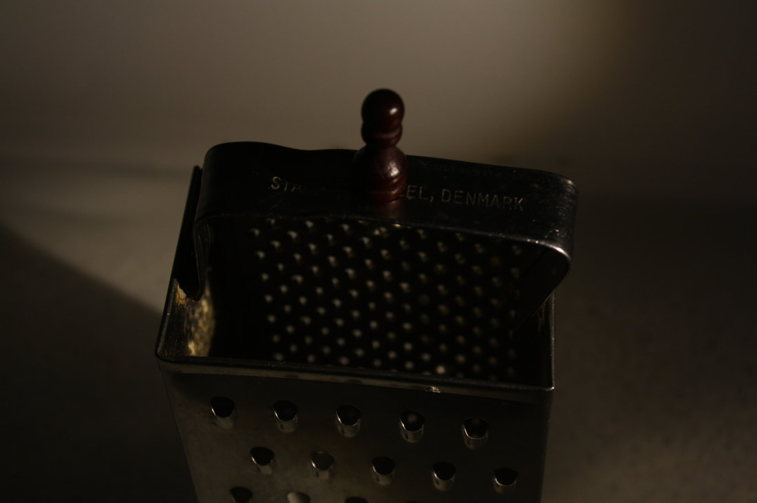
I think this is my best image for the second gallery. This is because I like the fact that the light is shining on the chess piece which outlines it on the cheese grater. Also I like the fact that there is light shining on the cheese grater to make it look like the light is coming from the bottom and coming upwards.
|
Worst Images
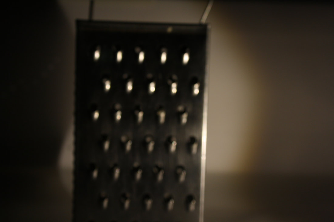
In my opinion this is my worst image for the first gallery because it is unclear. This makes the image look terrible.
Also there is too much light in random places of the image and too a tiny bit of dark. |
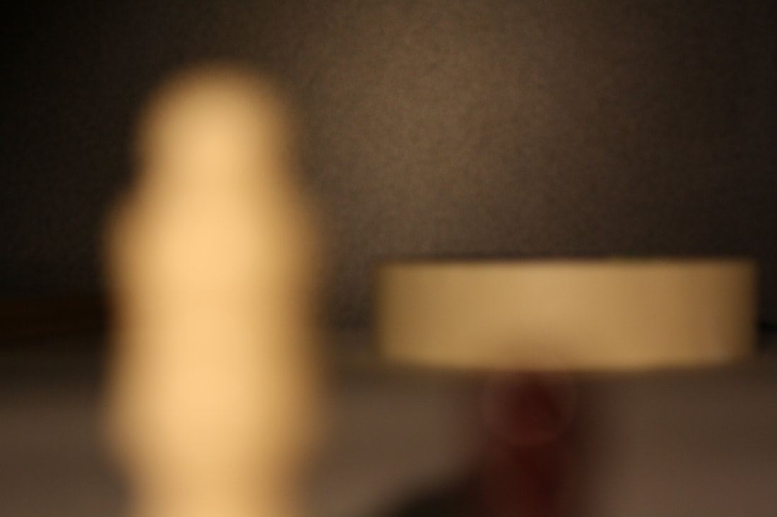
I think this my worse image as it is zoomed in too much and a tiny bit unclear. Also the light in the background is oddly shaped which doesn't make the cheese grater stand out.
|
Editing on Photoshop
On photo shop, I have changed the coloring on some of the objects to suit the image well as some of the chess pieces were brown and wouldn't fit in the black and white image. I increased the brightness and contrast to not only make the light and dark more visible but to increase the strength of the shadow against a white surface as done in the mood board example. After that, I decreased the exposure to darken the image to build on the shadows contrast.


My Final Image
I am really proud with the outcome of this image as it has the beaten the expectations I had for it. I really like the fact that the image has a shallow depth of field which helps compliment the exposure and the composition of the image. Also I really enjoy the layout of the chess pieces as they create a fantastic layout of shadows which involve multiple sizes. To improve on this image, next time I need to crop the image more evenly as the head of the chess piece on the left is slightly more cut out than the right.
My Second Shoot
For my second shoot, I plan on following the style of the black and white dominoes from the mood board. I intend on doing the exact same as the chess pieces and capture the shadow of the dominoes as done in the image in the mood board. I plan to group the dominoes near the end of the white paper in order to achieve the maximum size for the shadows. I am going to move the light as close and low as possible to the dominoes to increase the height of the shadows to create that extra dark theme on the white background.


My best image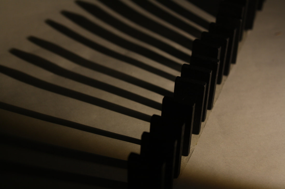
This is my best image because I really like the angle if the image was taken as it captures the shadow, as well as the dominoes. I really like the fact that the lighting has created a massive shadow contrasting against the white background. Also I like the fact that the dominoes look like they are about to fall as the shadow is getting closer as it go's further down.
|
My worst image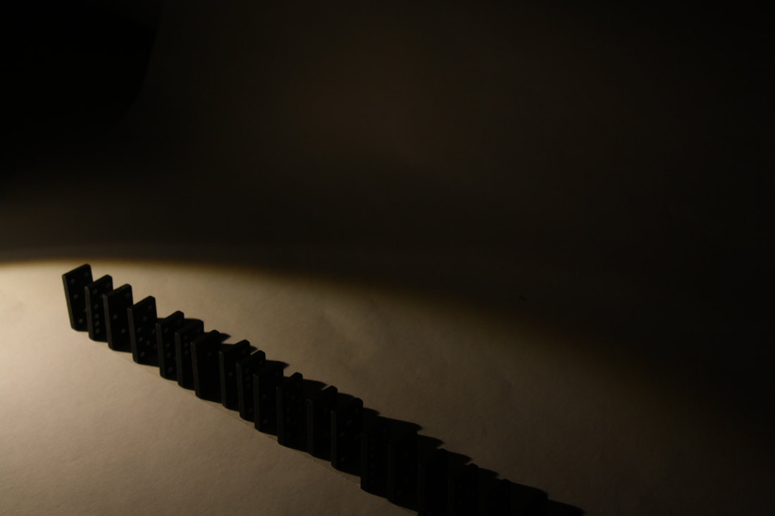
This is my worst image as the lighting is tremendously of the dominoes, creating a horrible tone to the image. Also the composition of the image is terrible as you can barely see the dominoes and the contrast. The shadows ruin the image as they are uneven and make the dominoes look wide.
|
Editing on Photoshop


My Final Image
My Third shoot
For my third shoot, I plan to use some of my last photo shoot to carry out this one by using a bit of still life. I intend on going of an old theme as I am going to use old objects. This will give the image justification as black and white were the stand out in old movies and pictures. Unlike the others, I am not going to create a shadow behind it as I am following a different theme.


Editing on Photoshop


My Final image
Tutorial:
https://www.youtube.com/watch?v=WGMDXOr4LmI
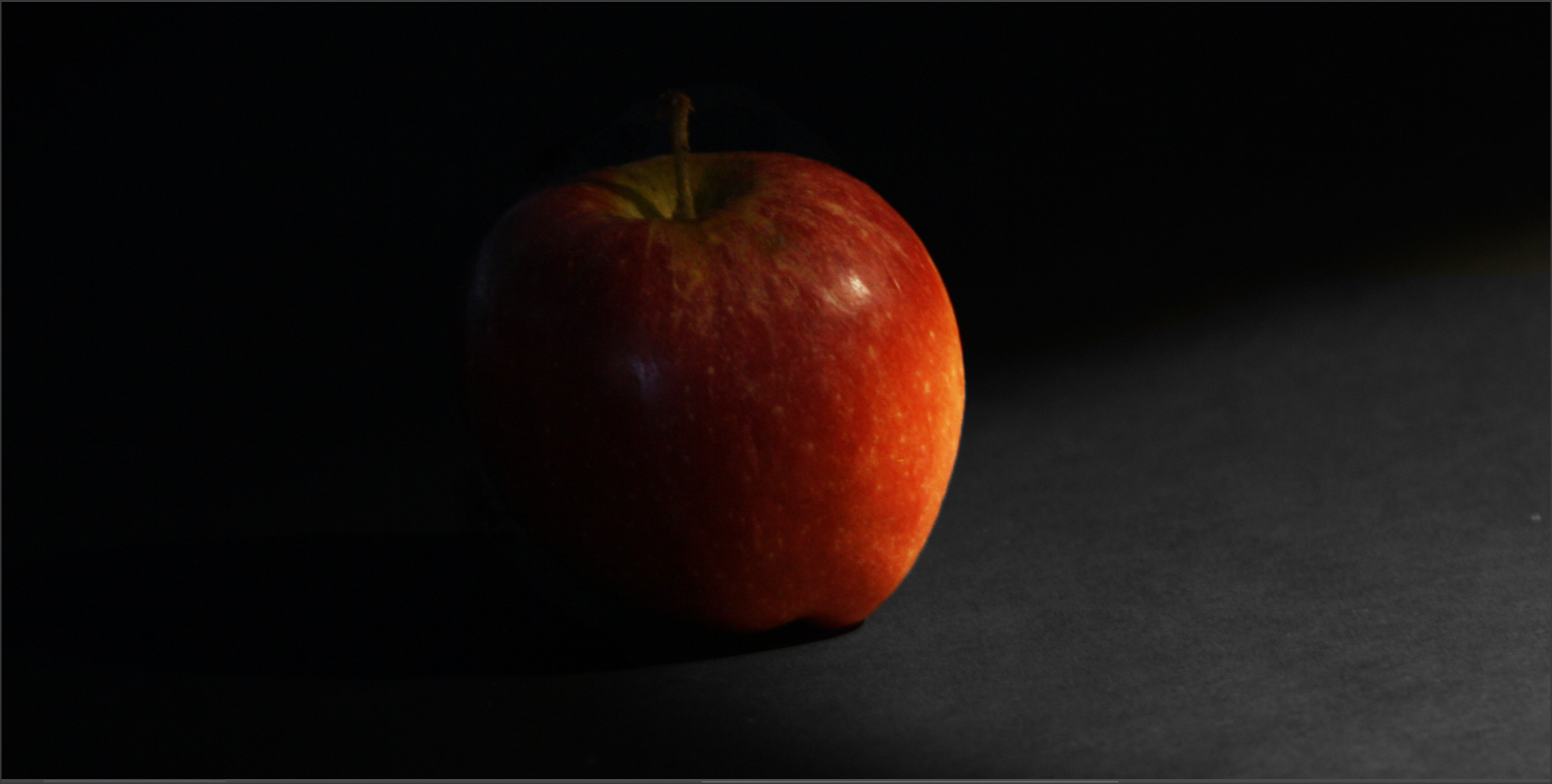
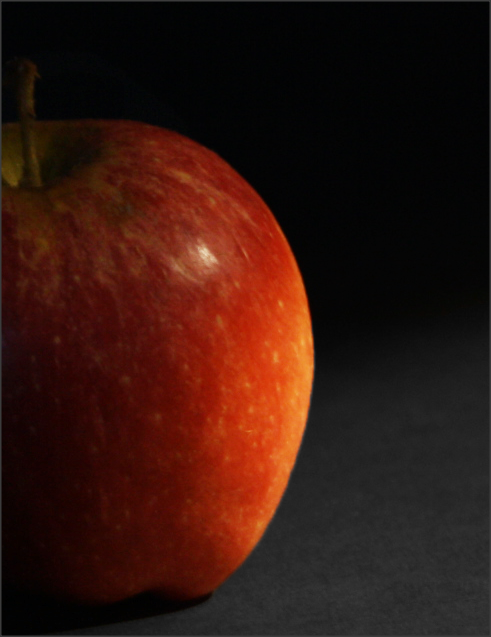
My Fourth Shoot
For my fourth shoot, I plan to refer back to my mood board by taking images of fruit. Similarly to my other photo shoots, I am going to try and capture a shadow behind it. I also intend to follow the method from the apple in the mood board and keep the red colour on the apple as it is in light and dark. This is because all of my other images follow the same pattern of being black and white.


Editing on Photoshop


My Final Images
|
|
Michael Levin


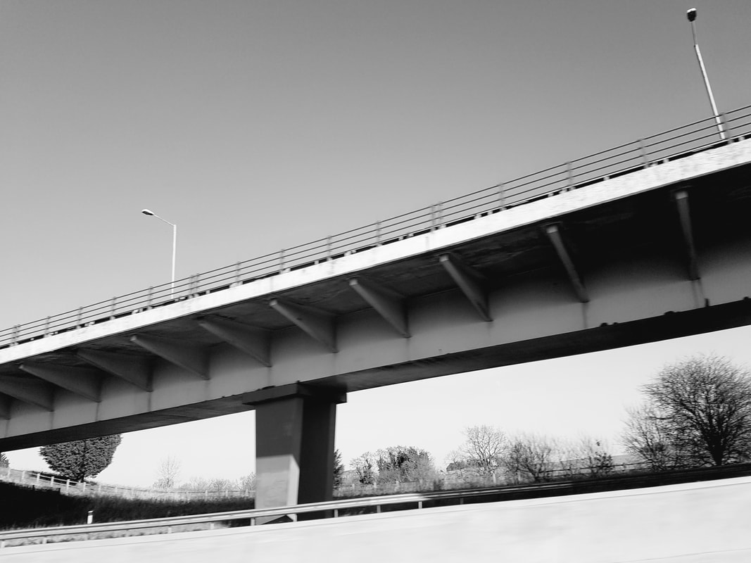
My Fifth shoot
For my fifth shoot, I plan to follow Michael Levin's style of light and dark by taking images of landscapes. I intend on visiting the Pine Lakes to follow his foot steps. I am going to try and take images of bridges so I can come up with an outcome some what similar to Michael Levin's images.


Editing on my phone


My Final Image
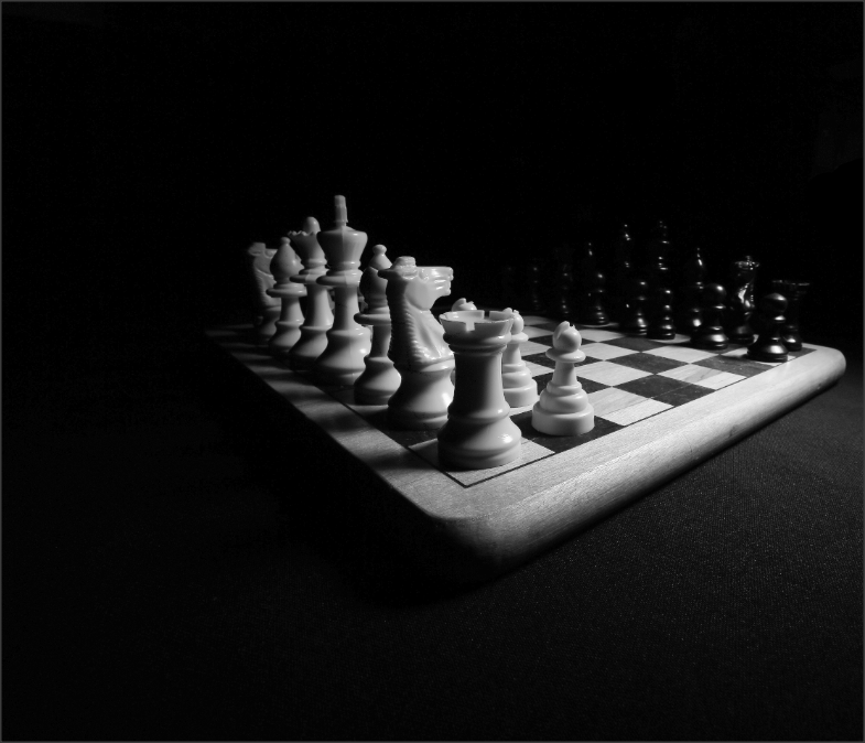
Professional Photography
Inspiration
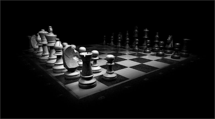
This image is inspiring as it takes the light and dark theme in photography in a great way. Not only does the chessboard show a contrast between light and dark through lighting, but it also shows a contrast between light and dark in color and angles. I intend on visiting a workshop designed by Justin(professional photographer) in the October holidays to further develop this project and go on a journey with the light and dark theme. Hopefully, I will take some similar images to the image above and I will photo shop them to make them look professional.


Best image
This is the best image as the composition on the image is perfect. Also,I like the lighting of the image as it is on the edge of the chess board like the image that inspired me. This has a great effect on the chess board as the white pieces are more exposed, whereas the black pieces are less exposed; creating a contrast between light and dark.
|
Worst image
This is my worst image as there is very little lighting on the black pieces and too much lighting on the white pieces which makes the image very vague and bleached. Also the angle of the chess board is terrible which blocks out the black pieces and you can't see the front of the white pieces.
|
Manipulating the image on photo shop


Final image
Final Gallery


Evaluation
For this project I started by looking at framing/light and dark. I then did some further research and decided to focus on the theme of light and dark because I thought that would be more interesting. The reason why I chose this theme is in my opinion not only is interesting but it will give me an opportunity to take some good images.
During this project the part I enjoyed the most was developing my skills and images by manipulating my outcomes in photo shop. I really enjoyed going onto the 'New Adjustment Layer' and exploring the different tools that are there for photography. The one filter I thought was most effective was black and white, to make the image stand out.
During this project, one new techniques I have experienced was how to the aperture and shutter speed setting on my camera. This helped me to realize how I could improve my images by adjusting the settings so that my images were not too dark or light. Another technique I experienced was how to sharpen my images to make either the light stand out on the dark or the dark stand out on the light background. I learnt how to use the 'lasso tool' and I improved the images further by sharpen my images.
On my next project the technique I would like develop further is how to improve my images by finding the correct locations. In order to do this I think I will need to plan in greater detail so that I spend time finding the correct backgrounds and locations which may mean I will need to take the camera home. I have realized, in order to get the best shots I need to be prepared to work in my own time and away from school.
This project I mainly focused on Michael Levins work on light and dark. I have followed his technique of cropping the images and editing them to light and dark. Also in his object images he created a large shadow behind the objects to make them stand out as they are in the light. I have followed this technique in most of my images.
By researching photographers who have focused on cropping their images for their main body of work, I have learnt that cropping an image in light and dark is very effective because it crops out the unnecessary parts of the image which would make the image look really cheap and rubbish. My photographers work focused on creating shadows of objects or places to gives the image more detail and to give the light more power as it stands out on the objects. This helped to shape my own images by realizing I needed to take images of a strong contrast of black white, following my photographers technique. I also looked at composition to help me with positioning the light in order for the dark to stand out to make my work look professional.
The technique I enjoyed the most was cropping my images as it boosts the image to a high standard. This is because I felt it developed my skills and helped me to refine my work. I also enjoyed using the manual settings on the camera and used ISO to make my images more darker. I also learnt how to set-up the lights which is a very important skill, especially in this project.
In my opinion the most successful part of the projects was my final image for photo shoot 5. This is because it contains two of my aims that I have set myself from my photographer which was: cropping my image and adding a shadow behind it. This makes the image look really powerful as it has colour as-well.
